There are many approaches for visualization of point data. Some of them are unusual. In this article, I’ll try to show different methods for visualization of the same data on maps. For this, I’ll use only ggplot2 package, but for data preprocessing I will need other packages (for example, maptools, sf, getcartr etc.).
First of all, let’s take a look at how we can show the same geographical information. We have data, which consist of coordinates. This is data about locations of McDonald’s restaurants in Europe, which I collected from Open Street Maps (OSM). They include only long and lat column. Also, we can:
map these coordinates as points;
calculate the density of points;
set a nearby area to a point;
estimate how many points are on each polygon (=region, country, etc.);
compute the shortest path through these points.
I think this is not a complete list of what we can do with this data. Also, let’s get this data first.
Data collection
I described how we could get data from OSM in one of my previous posts. But in this post, I collected lines data (about cycle paths). Here I want to get data about McDonald’s locations in Europe. Therefore I need to receive points, not lines.
This can be done directly using osmdata package. I recommend running this script as Job (This feature is in the preview versions Rstudio).
Hurray! We collected all European McDonald’s locations, which is marked in OSM.
Now it is possible to visualize data.
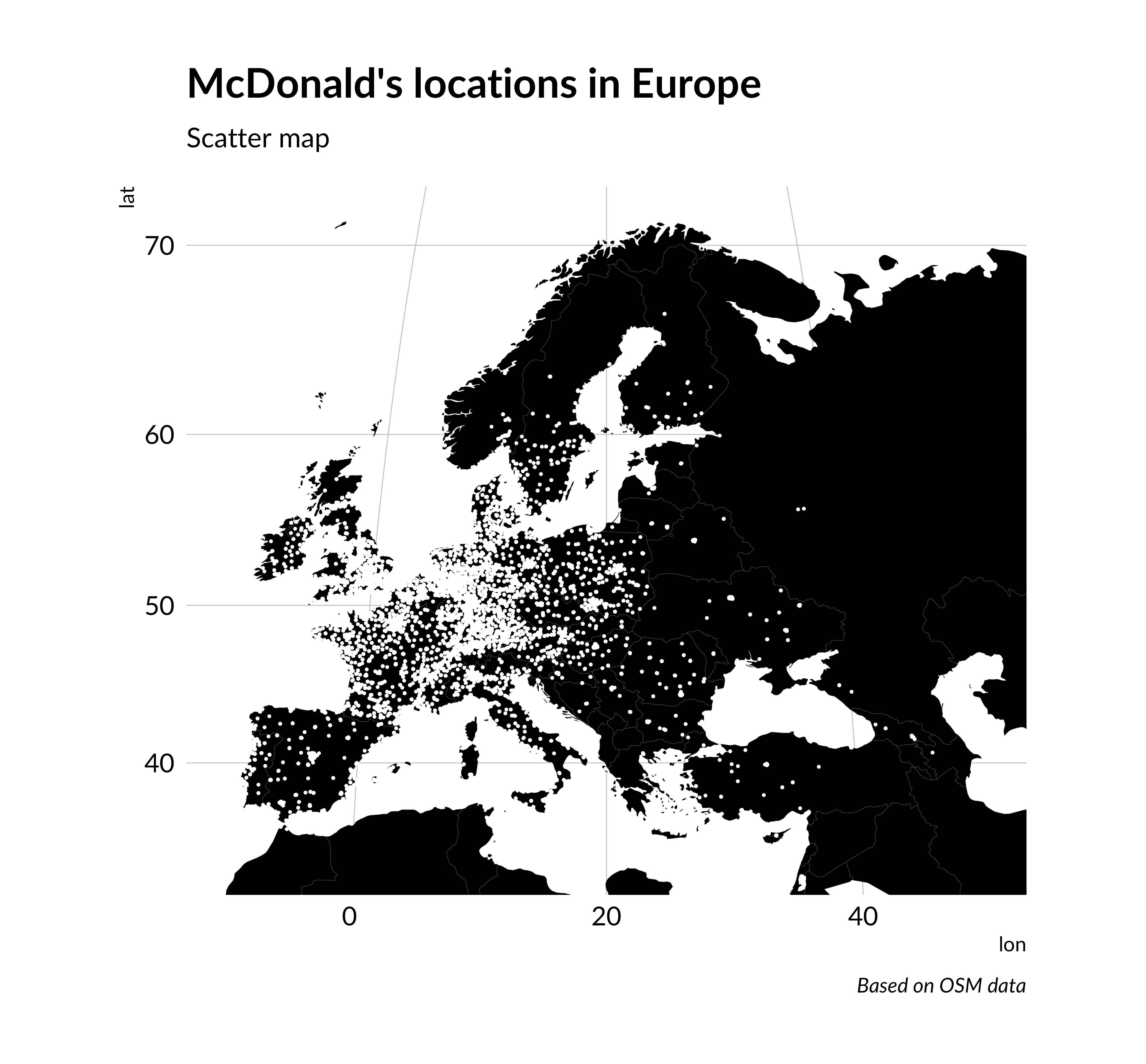
1. Scatter map
The simplest way to visualize points on the map is scatter map. In ggplot2 we can do it using borders and geom_point.
Code
require(ggplot2)require(hrbrthemes)scatterplot <-ggplot() +annotation_borders("world", xlim =c(-10, 50), ylim =c(33, 71), size =0.05, fill ="black") +geom_point(data = mcdonalds_points, aes(lon, lat), color ="white", size =0.1) +labs(title ="McDonald's locations in Europe",subtitle ="Scatter map",caption ="Based on OSM data" ) +theme_ipsum(base_family ="Lato") +theme(panel.grid =element_blank(),axis.text =element_blank(),axis.title =element_blank() ) +coord_map(projection ="gilbert", xlim =c(-10, 50), ylim =c(33, 71) )scatterplot
McDonald’s locations in Europe. Scatter map
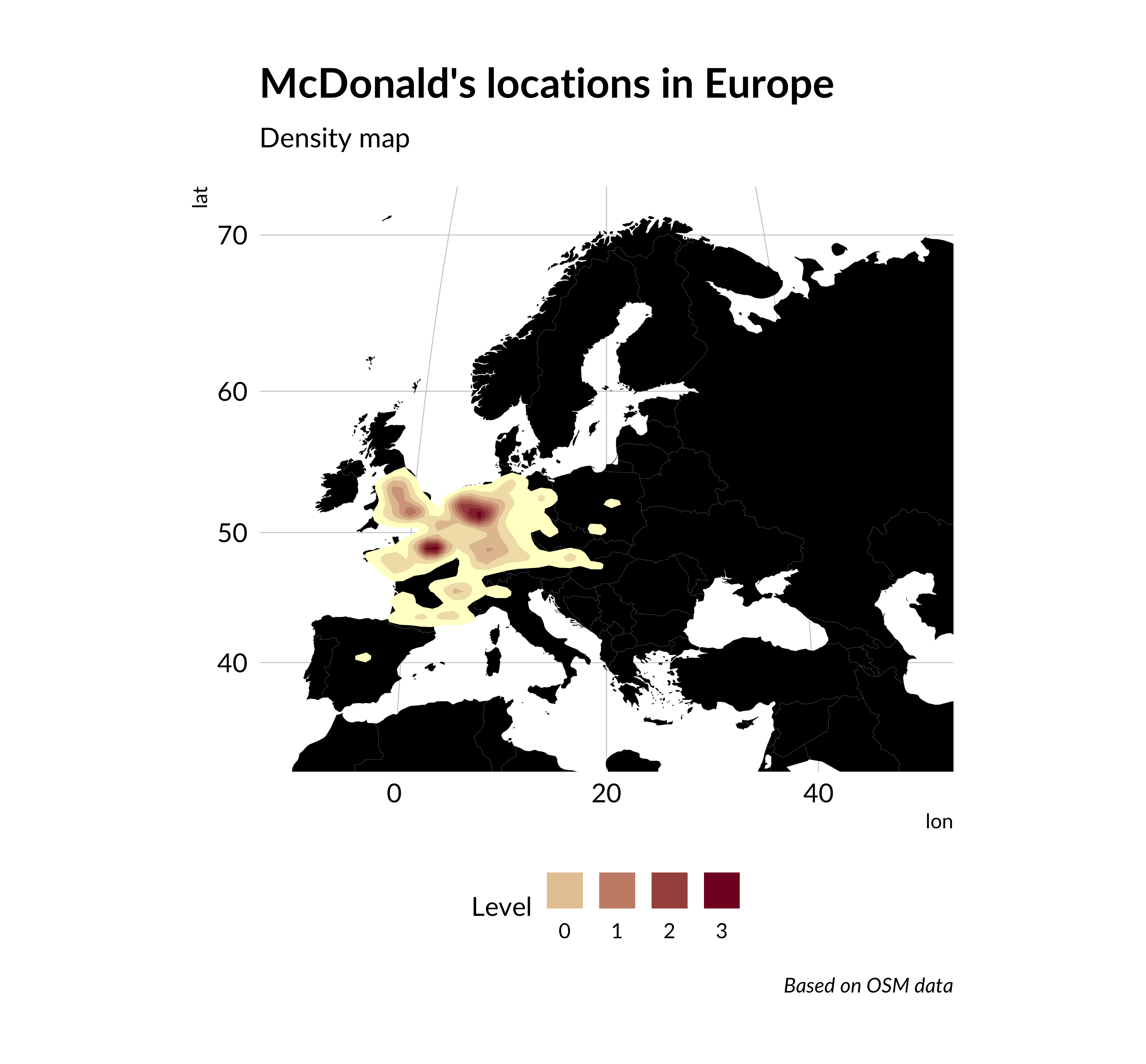
2. Density map
We can transform Scatterplot to density map changing geom_point to geom_density_2d and adding fill argument in geom_density_2d. For a better view, I added log1p scaling.
Code
density_map <-ggplot() +annotation_borders("world", xlim =c(-10, 50), ylim =c(33, 71), size =0.05, fill ="black") +stat_density_2d(data = mcdonalds_points,aes(lon, lat, fill =after_stat(scale(log1p(level)))),geom ="polygon", n =200 ) +scale_fill_gradient(low ="#ffffcc", high ="#800026",guide =guide_legend(label.position ="bottom", title ="Level" ) ) +labs(title ="McDonald's locations in Europe",subtitle ="Density map",caption ="Based on OSM data" ) +theme_ipsum(base_family ="Lato") +theme(panel.grid =element_blank(),axis.text =element_blank(),axis.title =element_blank(),legend.position ="bottom" ) +coord_map("gilbert", xlim =c(-10, 50), ylim =c(33, 71))density_map
McDonald’s locations in Europe. Density map
As we can see such a visualization show better main concentration of points.
3. Voronoi diagram
This visualization method is not as known as the previous ones, but its idea is also simple. Voronoi diagram or Voronoi tesselation partitioned plane into polygons based distance to point. To each point belongs an area which is closer to it than to other locations. If we place a new point in this area, it will be the nearest neighbor of the position, from which the area is created.
In the base version of ggplot2 there is no function for creating Voronoi diagram. But there are two methods of how to do it. We can create polygons based this points using st_voronoi function from sf package and then add created polygons as the layer to map in ggplot2. But there is a simpler way. There is no secret ggplot2 has many extensions. One of them is ggforce package which allows us to do Voronoi tesselation in ggplot2 (and not only this).
Creating such a visualization is as simple as a scatterplot. We only need to change the name of the layer in ggplot2 code instead of geom_point on geom_voronoi_segment.
Code
require(ggforce)voronoi_map <-ggplot() +annotation_borders("world", xlim =c(-10, 50), ylim =c(33, 71), size =0.05, fill ="black") +geom_voronoi_segment(data = mcdonalds_points, aes(lon, lat), color ="white", size =0.1) +labs(title ="McDonald's locations in Europe",subtitle ="Voronoi diagram",caption ="Based on OSM data" ) +theme_ipsum(base_family ="Lato") +theme(panel.grid =element_blank(),axis.text =element_blank(),axis.title =element_blank() ) +coord_map("gilbert", xlim =c(-10, 50), ylim =c(33, 71))voronoi_map
McDonald’s locations in Europe. Voronoi diagram
4. Delaunay triangulation
Voronoi diagram is not the only technique to division area based on points. A popular method is also Delaunay triangulation. The idea of Delaunay triangulation is to divide the space into triangles so that the circle that goes around the triangle includes only the vertex points of this triangle.
You can make this visualization similar to Voronoi diagram. sf package also has function to creating Delaunay polygons. But we are using again function from ggforce package. This is geom_delaunay_segment.
Code
delaunay_map <-ggplot() +annotation_borders("world", xlim =c(-10, 50), ylim =c(33, 71), size =0.05, fill ="black") +geom_delaunay_segment(data = mcdonalds_points,aes(lon, lat), color ="white", size =0.1 ) +labs(title ="McDonald's locations in Europe",subtitle ="Delaunay triangulation",caption ="Based on OSM data" ) +theme_ipsum(base_family ="Lato") +theme(panel.grid =element_blank(),axis.text =element_blank(),axis.title =element_blank() ) +coord_map("gilbert", xlim =c(-10, 50), ylim =c(33, 71))delaunay_map
McDonald’s locations in Europe. Delaunay triangulation
This visualization breaks the area more evenly than Voronoi diagram.
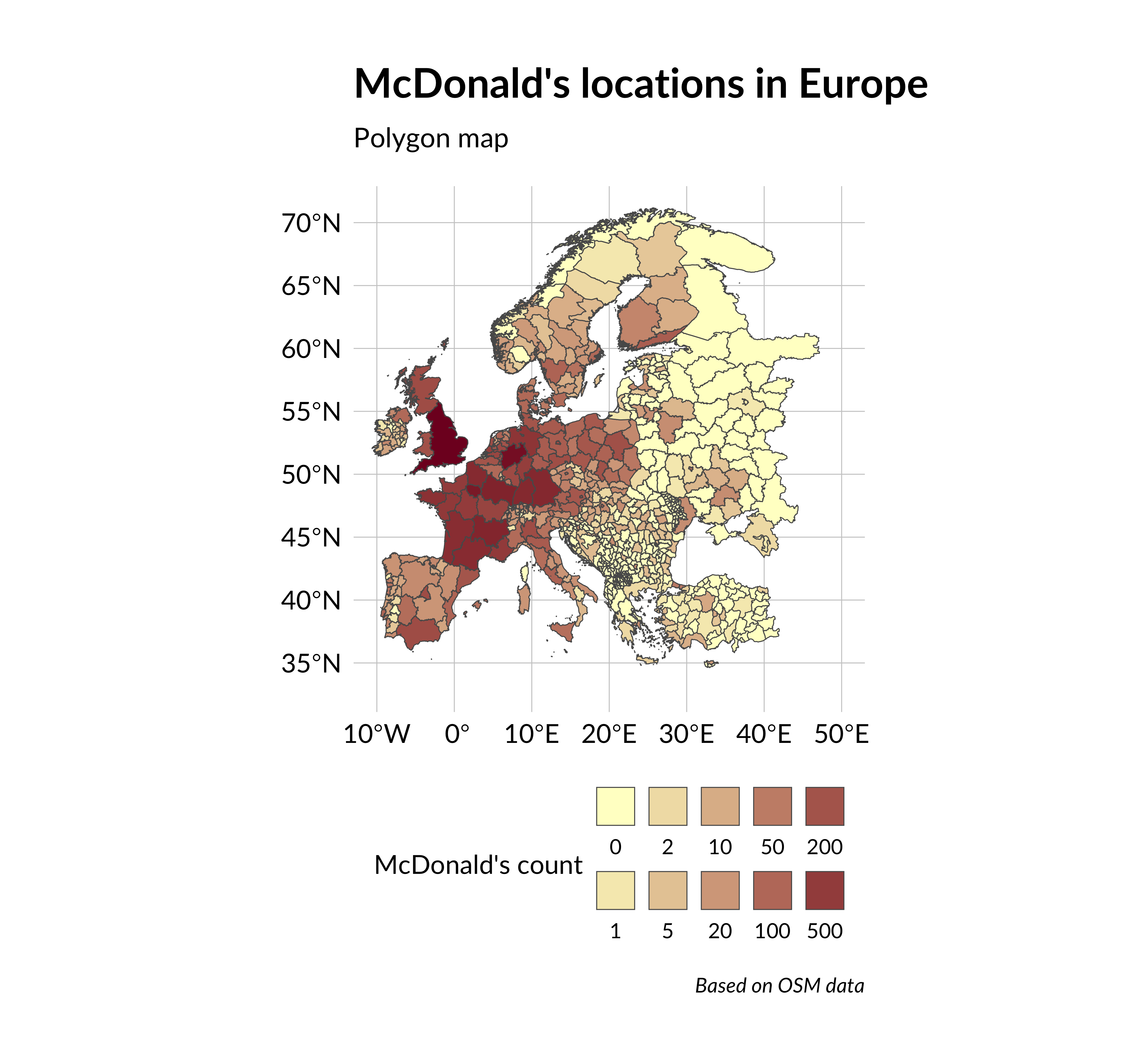
5. Polygon map
Also, we can calculate how many points lie in the polygon. For example, points data are useful, when we want to determine how many McDonald`s restaurants are in the region/country or the city, etc. I want to calculate the quantity of MacDonald’s in each European administrative region. To do this, we need to find polygon data about administrative boundaries for all European countries. Such data we can get from GADM (Global administrative areas). You can manually download files with maps on the GADM site, but there is a simpler way. I use gadm.sp.loadCountries function from GADMTools library for downloading GADM data. Also, I use gSimplify function from rgeos package for reducing shapes size and fortify from ggplot2 for converting `SpatialPolygonDataFrame object to data.frame. We need it for using this data in ggplot2 code. Note that not all countries have many levels of administrative division, then I wrote three different functions for handling different data options.
Now, we have european_regions data frame with data about all European administrative regions, then count the number of points in each of them. For this, I use point.in.polygon function from sp package, which calculates how many points lie in polygon based on lat&lon data.
Now we have added mcdonalds_in_polygon_count column to european_regions data frame, which represents the count of McDonald’s restaurants in the region. Next, we can draw a map with this data. The primary function we need geom_polygon. Also, I added scale_fill_gradient to make the map look better.
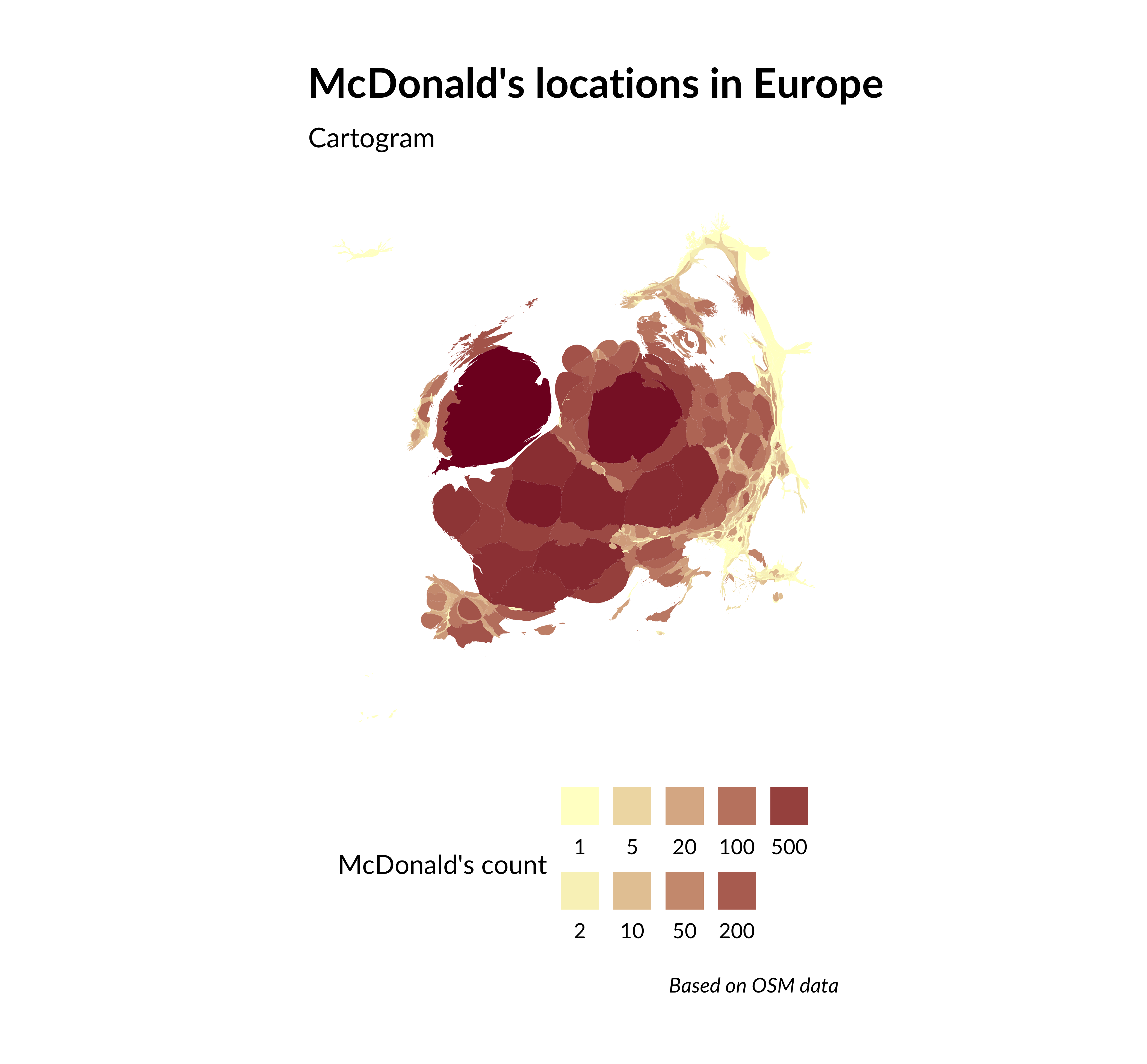
The amount of something in the polygon can be shown not only by color. You can also transform the polygons themselves. For example, you can change its size. Such transformations with polygons on the map are called cartograms.
6. Cartogram
In R the simplest way to make a cartogram is to use cartogram package, but I can tell from my experience that it is not efficient (it works too slowly). Then I use three packages to make cartograms - sf, Rcartogram & getcartr.
We need to convert data frame for SPDF because quick.carto for cartogram creation works only with SpatialPolygonDataFrame objects.
the code below does the following transformation:
european_regions data frame to sf object. sf object to shapefile. Shapefile is read as SPDF table. SPDF is transformed to cartogram using quick.carto function. SPDF is transformed into sf object for mapping.
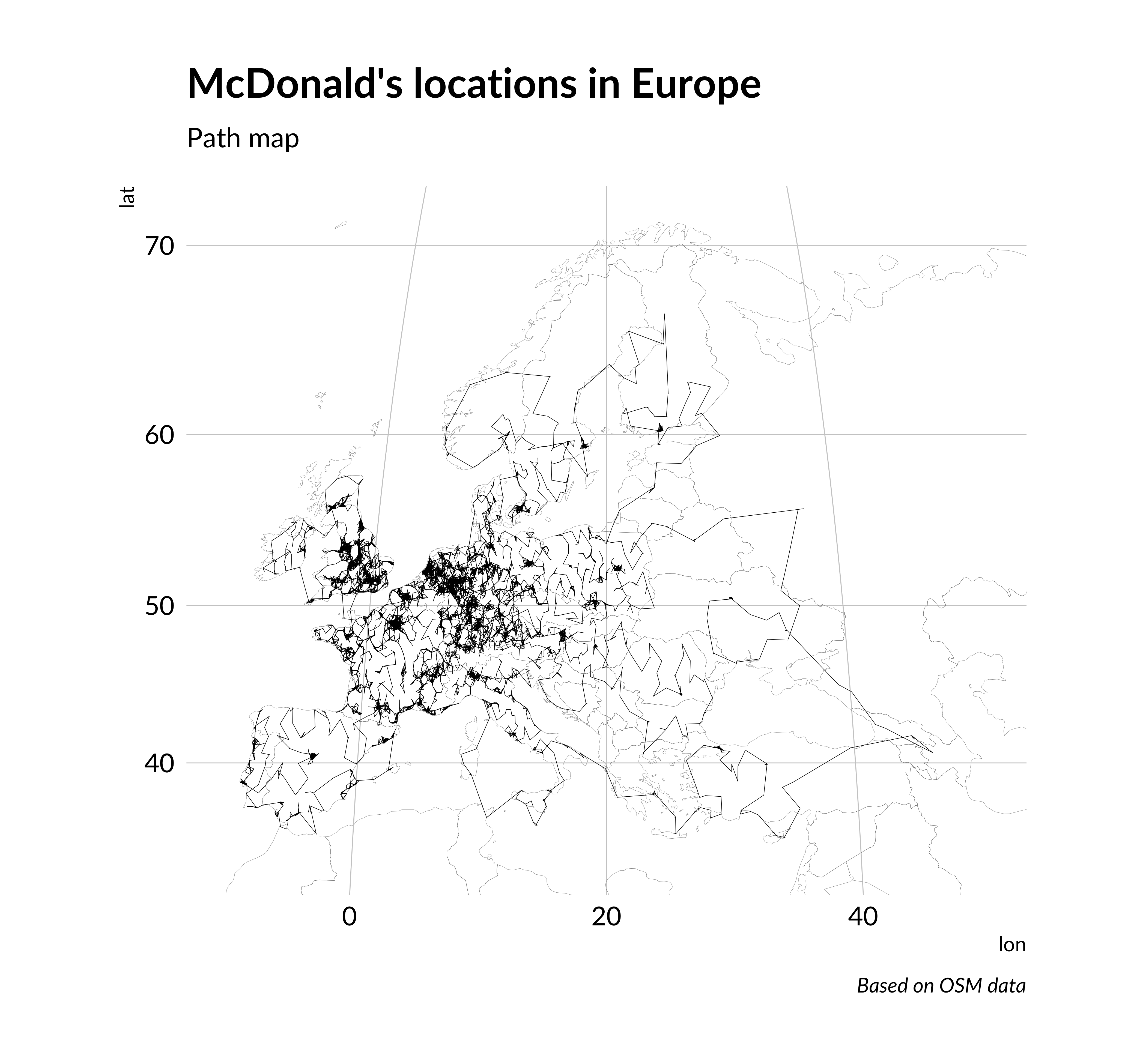
The last thing on these points is to make decisions of Traveling Salesman Problem. We can show the optimal path (close to this) through all points on the map. The best way to make this is LKH algorithm (Lin-Kernighan heuristic). This algorithm currently shows the best results. For example, last Traveling Santa competition on Kaggle won the team that used this algorithm.
Thus, using the example of McDonald’s locations, we demonstrated seven ways to show the same data.
Citation
BibTeX citation:
@online{kyrychenko2019,
  author = {Kyrychenko, Roman},
  title = {Seven Ways to Visualize Points on the Map Using Ggplot2 (on
    the Example of {McDonald’s} in {Europe)}},
  date = {2019-03-17},
  url = {https://randomforest.run/posts/ggplot-maps/ggplot-maps.html},
  langid = {en}
}
---title: "Seven ways to visualize points on the map using ggplot2 (on the example of McDonald's in Europe)"description: | Visualization methods for points dataauthor: - name: Roman Kyrychenko url: https://www.linkedin.com/in/kirichenko17roman/date: 2019-03-17format: html: toc: true code-tools: truetwitter: creator: "@KyrychenkoRoman"categories: - ggplot2 - OSM - sf - Voronoi diagram - Delaunay triangulation - density map - scatter map - cartogram - patchwork - TSP - LKHcreative_commons: CC BYimage: "radix-preview.png"citation: true---```{r setup, include=FALSE}knitr::opts_chunk$set(echo = FALSE, message = FALSE, warning = FALSE)```There are many approaches for visualization of point data. Some of them are unusual. In this article, I'll try to show different methods for visualization of the same data on maps. For this, I'll use only `ggplot2` package, but for data preprocessing I will need other packages (for example, `maptools, sf, getcartr` etc.).First of all, let's take a look at how we can show the same geographical information. We have data, which consist of coordinates. This is data about locations of McDonald's restaurants in Europe, which I collected from Open Street Maps (OSM). They include only long and lat column. Also, we can:- map these coordinates as points;- calculate the density of points;- set a nearby area to a point;- estimate how many points are on each polygon (=region, country, etc.);- compute the shortest path through these points.I think this is not a complete list of what we can do with this data. Also, let's get this data first.## Data collectionI described how we could get data from OSM in one of my previous posts. But in this post, I collected lines data (about cycle paths). Here I want to get data about McDonald's locations in Europe. Therefore I need to receive points, not lines.This can be done directly using `osmdata` package. I recommend running this script as Job (This feature is in the [preview versions Rstudio](https://www.rstudio.com/products/rstudio/download/preview/)).```{r data_collect, echo=TRUE, dpi=250, cache.lazy=TRUE, eval=FALSE}require(osmdata)# for limitb <- combn(seq(-17, 50, 2), 2) %>% t()b <- b[!duplicated(b[, 1]), ]set_overpass_url("https://overpass-api.de/api/interpreter")mcdonalds_points <- lapply(1:33, function(i) { cw <- opq( bbox = c(b[i, 1], 35, b[i, 2], 70), timeout = 300, memsize = 1073741824 ) %>% add_osm_feature("amenity", "fast_food") %>% add_osm_feature( key = "name", value = c("McDonald's", "McDonalds"), value_exact = FALSE, match_case = F ) cwmap <- osmdata_sf(cw) cat(i / 33, "\n") cwmap$osm_points})coords <- purrr::safely(function(x) { f <- dplyr::as_tibble(x@coords) colnames(f) <- c("lon", "lat") f})mcdonalds_points <- purrr::map_dfr( mcdonalds_points, function(x) { coords(x)$result }) %>% distinct()# save data into rds formatreadr::write_rds(mcdonalds_points, "mcdonalds.rds")```Hurray! We collected all European McDonald's locations, which is marked in OSM.Now it is possible to visualize data.```{r mcdonalds_points, include=FALSE, echo=TRUE}mcdonalds_points <- readr::read_rds("mcdonalds.rds")```## 1. Scatter mapThe simplest way to visualize points on the map is scatter map. In `ggplot2` we can do it using `borders` and `geom_point`.```{r scatterplot, dpi=300, fig.height=6.5, fig.width=7, echo=TRUE, fig.cap="McDonald's locations in Europe. Scatter map"}require(ggplot2)require(hrbrthemes)scatterplot <- ggplot() + annotation_borders("world", xlim = c(-10, 50), ylim = c(33, 71), size = 0.05, fill = "black") + geom_point(data = mcdonalds_points, aes(lon, lat), color = "white", size = 0.1) + labs( title = "McDonald's locations in Europe", subtitle = "Scatter map", caption = "Based on OSM data" ) + theme_ipsum(base_family = "Lato") + theme( panel.grid = element_blank(), axis.text = element_blank(), axis.title = element_blank() ) + coord_map( projection = "gilbert", xlim = c(-10, 50), ylim = c(33, 71) )scatterplot```## 2. Density mapWe can transform Scatterplot to density map changing `geom_point` to `geom_density_2d` and adding fill argument in `geom_density_2d`. For a better view, I added `log1p` scaling.```{r density_map, dpi=300, fig.height=6.5, fig.width=7, echo=TRUE, fig.cap="McDonald's locations in Europe. Density map"}density_map <- ggplot() + annotation_borders("world", xlim = c(-10, 50), ylim = c(33, 71), size = 0.05, fill = "black") + stat_density_2d( data = mcdonalds_points, aes(lon, lat, fill = after_stat(scale(log1p(level)))), geom = "polygon", n = 200 ) + scale_fill_gradient( low = "#ffffcc", high = "#800026", guide = guide_legend( label.position = "bottom", title = "Level" ) ) + labs( title = "McDonald's locations in Europe", subtitle = "Density map", caption = "Based on OSM data" ) + theme_ipsum(base_family = "Lato") + theme( panel.grid = element_blank(), axis.text = element_blank(), axis.title = element_blank(), legend.position = "bottom" ) + coord_map("gilbert", xlim = c(-10, 50), ylim = c(33, 71))density_map```As we can see such a visualization show better main concentration of points.## 3. Voronoi diagramThis visualization method is not as known as the previous ones, but its idea is also simple. Voronoi diagram or Voronoi tesselation partitioned plane into polygons based distance to point. To each point belongs an area which is closer to it than to other locations. If we place a new point in this area, it will be the nearest neighbor of the position, from which the area is created.In the base version of `ggplot2` there is no function for creating Voronoi diagram. But there are two methods of how to do it. We can create polygons based this points using `st_voronoi` function from `sf` package and then add created polygons as the layer to map in `ggplot2`. But there is a simpler way. There is no secret `ggplot2` has many extensions. One of them is `ggforce` package which allows us to do Voronoi tesselation in `ggplot2` (and not only this).Creating such a visualization is as simple as a scatterplot. We only need to change the name of the layer in `ggplot2` code instead of `geom_point` on `geom_voronoi_segment`.```{r voronoi_map, dpi=300, fig.height=6.5, fig.width=7, echo=TRUE, fig.cap="McDonald's locations in Europe. Voronoi diagram", preview=TRUE}require(ggforce)voronoi_map <- ggplot() + annotation_borders("world", xlim = c(-10, 50), ylim = c(33, 71), size = 0.05, fill = "black") + geom_voronoi_segment(data = mcdonalds_points, aes(lon, lat), color = "white", size = 0.1) + labs( title = "McDonald's locations in Europe", subtitle = "Voronoi diagram", caption = "Based on OSM data" ) + theme_ipsum(base_family = "Lato") + theme( panel.grid = element_blank(), axis.text = element_blank(), axis.title = element_blank() ) + coord_map("gilbert", xlim = c(-10, 50), ylim = c(33, 71))voronoi_map```## 4. Delaunay triangulationVoronoi diagram is not the only technique to division area based on points. A popular method is also Delaunay triangulation. The idea of Delaunay triangulation is to divide the space into triangles so that the circle that goes around the triangle includes only the vertex points of this triangle.You can make this visualization similar to Voronoi diagram. `sf` package also has function to creating Delaunay polygons. But we are using again function from `ggforce` package. This is `geom_delaunay_segment`.```{r delaunay_map, dpi=300, fig.height=6.5, fig.width=7, echo=TRUE, fig.cap="McDonald's locations in Europe. Delaunay triangulation"}delaunay_map <- ggplot() + annotation_borders("world", xlim = c(-10, 50), ylim = c(33, 71), size = 0.05, fill = "black") + geom_delaunay_segment( data = mcdonalds_points, aes(lon, lat), color = "white", size = 0.1 ) + labs( title = "McDonald's locations in Europe", subtitle = "Delaunay triangulation", caption = "Based on OSM data" ) + theme_ipsum(base_family = "Lato") + theme( panel.grid = element_blank(), axis.text = element_blank(), axis.title = element_blank() ) + coord_map("gilbert", xlim = c(-10, 50), ylim = c(33, 71))delaunay_map```This visualization breaks the area more evenly than Voronoi diagram.## 5. Polygon mapAlso, we can calculate how many points lie in the polygon. For example, points data are useful, when we want to determine how many McDonald\`s restaurants are in the region/country or the city, etc. I want to calculate the quantity of MacDonald's in each European administrative region. To do this, we need to find polygon data about administrative boundaries for all European countries. Such data we can get from GADM (Global administrative areas). You can manually download files with maps on the [GADM site](https://gadm.org/), but there is a simpler way. I use `gadm.sp.loadCountries` function from `GADMTools` library for downloading GADM data. Also, I use `gSimplify` function from `rgeos` package for reducing shapes size and fortify from ggplot2 for converting \``SpatialPolygonDataFrame` object to `data.frame`. We need it for using this data in `ggplot2` code. Note that not all countries have many levels of administrative division, then I wrote three different functions for handling different data options.```{r polygon_preproc, echo=TRUE, eval=FALSE}require(dplyr)gadm_level <- purrr::safely(function(x, y=2) { fl <- glue::glue("{x}_adm{y}.sf.rds") if (file.exists(fl)){ readr::read_rds(fl) } else { GADMTools::gadm_sf.loadCountries( x, level = y, basefile = "./")$sf }})gadm <- function(x) { f <- gadm_level(x, 1)$result if (is.null(f)) { f <- gadm_level(x, 2)$result } if (is.null(f)) { f <- gadm_level(x, 0)$result } f}european_regions <- purrr::map_dfr(c( "ARM", "ALB", "AND", "AUT", "AZE", "BEL", "BGR", "BIH", "BLR", "CHE", "CYP", "CZE", "DEU", "DNK", "EST", "FIN", "FRA", "GBR", "GEO", "GRC", "HRV", "HUN", "IRL", "ISL", "ITA", "KAZ", "ESP", "LIE", "LTU", "LUX", "LVA", "MDA", "MKD", "MLT", "MNE", "NLD", "NOR", "POL", "PRT", "ROU", "RUS", "SMR", "SRB", "SVK", "SVN", "SWE", "TUR", "UKR", "VGB", "XKO"), gadm) %>% mutate(x_min = as.numeric(purrr::map_dbl(geometry, ~sf::st_bbox(.)[1])), x_max = as.numeric(purrr::map_dbl(geometry, ~sf::st_bbox(.)[3])), y_min = as.numeric(purrr::map_dbl(geometry, ~sf::st_bbox(.)[2]))) %>% dplyr::filter(x_min < 40) %>% dplyr::filter(x_max < 50) %>% dplyr::filter(x_min > -30) %>% dplyr::filter(y_min > -70)european_regions <- rmapshaper::ms_simplify( input = as(european_regions, 'Spatial')) %>% sf::st_as_sf()``````{r, echo=FALSE, eval=FALSE}readr::write_rds(european_regions, "european_regions.rds")``````{r, echo=FALSE, eval=TRUE}european_regions <- readr::read_rds("european_regions.rds")```Now, we have european_regions data frame with data about all European administrative regions, then count the number of points in each of them. For this, I use `point.in.polygon` function from `sp` package, which calculates how many points lie in polygon based on lat&lon data.```{r european_regions_df, echo=TRUE}require(dplyr)require(sf)mcdonalds_sf <- mcdonalds_points %>% as.matrix() %>% st_multipoint() %>% st_sfc() %>% st_cast('POINT') %>% st_set_crs(4326) %>% st_sf() european_regions <- european_regions %>% rowwise() %>% mutate( mcdonalds_in_polygon_count = nrow( st_filter( mcdonalds_sf, geometry )) )```Now we have added `mcdonalds_in_polygon_count` column to `european_regions` data frame, which represents the count of McDonald's restaurants in the region. Next, we can draw a map with this data. The primary function we need `geom_polygon`. Also, I added `scale_fill_gradient` to make the map look better.```{r polygon_map, dpi=300, fig.height=6.5, fig.width=7, echo=TRUE, fig.cap="McDonald's locations in Europe. Polygon map"}polygon_map <- ggplot() + geom_sf( data = european_regions, aes( fill = mcdonalds_in_polygon_count )) + scale_fill_gradient( low = "#ffffcc", high = "#800026", guide = guide_legend( label.position = "bottom", title = "McDonald's count" ), trans = "log1p", # for better gradient breaks = c(0, 1, 2, 5, 10, 20, 50, 100, 200, 500), labels = c(0, 1, 2, 5, 10, 20, 50, 100, 200, 500) ) + labs( title = "McDonald's locations in Europe", subtitle = "Polygon map", caption = "Based on OSM data" ) + theme_ipsum(base_family = "Lato") + theme( panel.grid = element_blank(), axis.text = element_blank(), axis.title = element_blank(), legend.position = "bottom" ) + coord_sf(xlim = c(-10, 50), ylim = c(33, 71))polygon_map```The amount of something in the polygon can be shown not only by color. You can also transform the polygons themselves. For example, you can change its size. Such transformations with polygons on the map are called cartograms.## 6. CartogramIn R the simplest way to make a cartogram is to use `cartogram` package, but I can tell from my experience that it is not efficient (it works too slowly). Then I use three packages to make cartograms - `sf`, `Rcartogram` & `getcartr`.We need to convert data frame for `SPDF` because `quick.carto` for cartogram creation works only with `SpatialPolygonDataFrame` objects.the code below does the following transformation:`european_regions` data frame to sf object. `sf` object to shapefile. Shapefile is read as `SPDF` table. `SPDF` is transformed to cartogram using `quick.carto` function. SPDF is transformed into `sf` object for mapping.```{r packages, echo=TRUE, eval=FALSE}require(sf)require(cartogram)european_regions_cartog_cont <- cartogram_cont( st_transform(european_regions, 3857) %>% mutate(mcdonalds_in_polygon_count = mcdonalds_in_polygon_count+1), weight = "mcdonalds_in_polygon_count")``````{r cartogram_preproc, echo=FALSE, cache.lazy=TRUE, eval=FALSE}st_write(european_regions_cartog_cont, "eu_mac.shp", append=FALSE)``````{r eu_mac_load, echo=FALSE}european_regions_cartog_cont <- st_read("eu_mac.shp")```Now we can map it.```{r cartogram_map, dpi=300, fig.height=6.5, fig.width=7, echo=TRUE, fig.cap="McDonald's locations in Europe. Cartogram"}cartogram_map <- ggplot(european_regions_cartog_cont) + geom_sf(aes(fill = mcdn___), color = NA) + coord_sf(datum = NA) + scale_fill_gradient( low = "#ffffcc", high = "#800026", guide = guide_legend( label.position = "bottom", title = "McDonald's count" ), trans = "log1p", breaks = c(0, 1, 2, 5, 10, 20, 50, 100, 200, 500), labels = c(0, 1, 2, 5, 10, 20, 50, 100, 200, 500) ) + labs( title = "McDonald's locations in Europe", subtitle = "Cartogram", caption = "Based on OSM data" ) + theme_ipsum(base_family = "Lato") + theme( panel.grid = element_blank(), axis.text = element_blank(), axis.title = element_blank(), legend.position = "bottom" )cartogram_map```It looks unusual.## 7. Optimal pathThe last thing on these points is to make decisions of Traveling Salesman Problem. We can show the optimal path (close to this) through all points on the map. The best way to make this is LKH algorithm (Lin-Kernighan heuristic). This algorithm currently shows the best results. For example, [last Traveling Santa competition on Kaggle](https://www.kaggle.com/c/traveling-santa-2018-prime-paths) won the team that used this algorithm.It is described [here](http://akira.ruc.dk/~keld/research/LKH/).For implementation, we can write a file with model parameters.```{r tsp, echo=TRUE, dpi=250, cache.lazy=TRUE, eval=FALSE}write_tsp <- function(nodes, filename, name = "McDonalds") { write(paste0("NAME : ", name), filename) write(paste0("COMMENT : ", name), filename, append = T) write("TYPE : TSP", filename, append = T) write(paste0("DIMENSION : ", nrow(nodes)), filename, append = T) write("EDGE_WEIGHT_TYPE : EUC_2D", filename, append = T) write("NODE_COORD_SECTION", filename, append = T) for (row in 1:nrow(nodes)) { write(paste(row, nodes[row, 1][[1]], nodes[row, 2][[1]]), filename, append = T) } write("EOF", filename, append = T)}write_tsp(mcdonalds_points, "mcdonalds_points.tsp")```Download and compile LKH files.```{bash lkh_download_run, echo=TRUE, dpi=250, cache.lazy=TRUE, eval=FALSE}rm -r LKH-2.0.9rm LKH-2.0.9.t*wget http://akira.ruc.dk/~keld/research/LKH/LKH-2.0.9.tgztar xzvf LKH-2.0.9.tgzcd LKH-2.0.9makemv LKH ..cd ..rm -r LKH-2.0.9```Make a file with model parameters.```{r tsp_param, echo=TRUE, dpi=250, cache.lazy=TRUE, eval=FALSE}tsp_param <- dplyr::tibble( PROBLEM_FILE = "mcdonalds_points.tsp", TOUR_FILE = "mcdonalds_points.tour", CANDIDATE_SET_TYPE = "POPMUSIC", INITIAL_PERIOD = 100, INITIAL_TOUR_ALGORITHM = "GREEDY", MAX_TRIALS = 20, MOVE_TYPE = 5, PATCHING_C = 5, PATCHING_A = 1, RECOMBINATION = "GPX2", RUNS = 1)write_parameters <- function(parameters, filename) { write(paste0(colnames(parameters), " = ", parameters[1, ]) %>% paste(collapse = "\n"), filename)}write_parameters(tsp_param, "tsp_param.par")```Run the model.```{bash lkh1, echo=TRUE, dpi=250, cache.lazy=TRUE, eval=FALSE}./LKH tsp_param.par```Make a file with model parameters again.```{r tsp_param2, echo=TRUE, dpi=250, cache.lazy=TRUE, eval=FALSE}tsp_param2 <- dplyr::tibble( PROBLEM_FILE = "mcdonalds_points.tsp", TOUR_FILE = "mcdonalds_points_full.tour", CANDIDATE_SET_TYPE = "POPMUSIC", INITIAL_PERIOD = 100, INITIAL_TOUR_ALGORITHM = "GREEDY", SUBPROBLEM_TOUR_FILE = "mcdonalds_points.tour", SUBPROBLEM_SIZE = "50000 ROHE BORDERS COMPRESSED", MAX_TRIALS = 100, MOVE_TYPE = 5, PATCHING_C = 5, PATCHING_A = 1, RECOMBINATION = "GPX2", RUNS = 10)write_parameters(tsp_param2, "tsp_param2.par")```Run model (stage 2).```{bash lkh2, echo=TRUE, dpi=250, cache.lazy=TRUE, eval=FALSE}./LKH tsp_param2.par```Read result with a tour to data frame.```{r tour_creation, echo=TRUE}tour <- readr::read_csv("mcdonalds_points_full.tour", skip = 5)tour <- tour[-nrow(tour), ]tour <- tour[-nrow(tour), ]mcdonalds_tour <- mcdonalds_points[tour$TOUR_SECTION, ]mcdonalds_tour <- bind_rows(mcdonalds_tour, mcdonalds_tour[1, ])```Visualize it.```{r tsp_map, dpi=300, fig.height=6.5, fig.width=7, echo=TRUE, fig.cap="McDonald's locations in Europe. Path map"}tsp_map <- ggplot() + borders("world", xlim = c(-10, 50), ylim = c(33, 71), size = 0.05) + geom_path(data = mcdonalds_tour, aes(lon, lat), color = "black", size = 0.1) + labs( title = "McDonald's locations in Europe", subtitle = "Path map", caption = "Based on OSM data" ) + theme_ipsum(base_family = "Lato") + theme( panel.grid = element_blank(), axis.text = element_blank(), axis.title = element_blank() ) + coord_map("gilbert", xlim = c(-10, 50), ylim = c(33, 71))tsp_map```This is an optimized path through all of McDonald's locations in Europe.## Putting all togetherAnd finally, we will do a general visualization. The best way is using `patchwork` to combine `ggplot2` charts.You can install the package as follows: `devtools::install_github("thomasp85/patchwork")````{r combined_map, dpi=300, fig.height=37.5, fig.width=30, echo=TRUE, fig.cap="McDonald's locations in Europe"}#| column: screen#| out-width: 100%#| fig-format: svgrequire(patchwork)(scatterplot | tsp_map) /(voronoi_map | delaunay_map) /(cartogram_map | polygon_map) /(density_map)```Thus, using the example of McDonald's locations, we demonstrated seven ways to show the same data.