Random Forest: blog about data
R programming, data visualization, applied statistics, and machine learning — by Roman Kyrychenko

ggplot2latex: Export ggplot2 Figures to LaTeX Without the Bloat
R
ggplot2
LaTeX
ggplot2latex
visualizations
reproducibility

telegramR: Scraping Telegram Channels with R
R
telegramR
data collection
social media
NLP
text analysis
Voter Flows Between Two Parliamentary Elections in Finland
nnls
flow analysis
ggplot2
visualizations
election data
election statistics
.png)
United Nations General Assembly Voting graph analysis
ggplot2
ggraph
tidygraph
graph analysis
visualizations
Analysing voters flows without using sociological data
nnls
flow analysis
ggplot2
visualizations
election data
election statistics
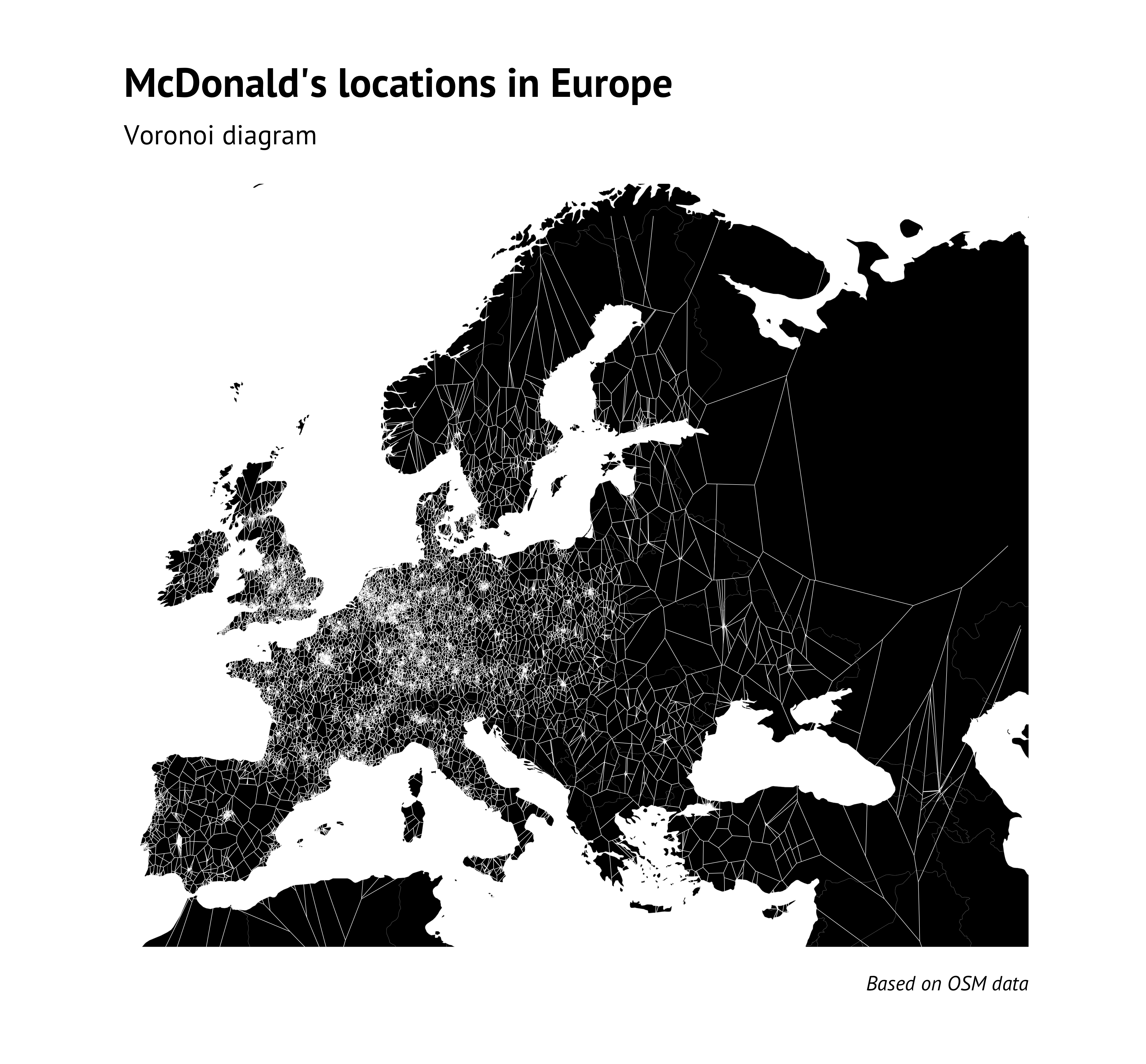
Seven ways to visualize points on the map using ggplot2 (on the example of McDonald’s in Europe)
ggplot2
OSM
sf
Voronoi diagram
Delaunay triangulation
density map
scatter map
cartogram
patchwork
TSP
LKH

European values clustering using R
ggplot2
values
ESS
GeoClust
visualizations
spatial statistics

European map of cycle paths using OSM and ggplot2
ggplot2
osmdata
OSM
cycle
visualizations
spatial statistics

No matching items