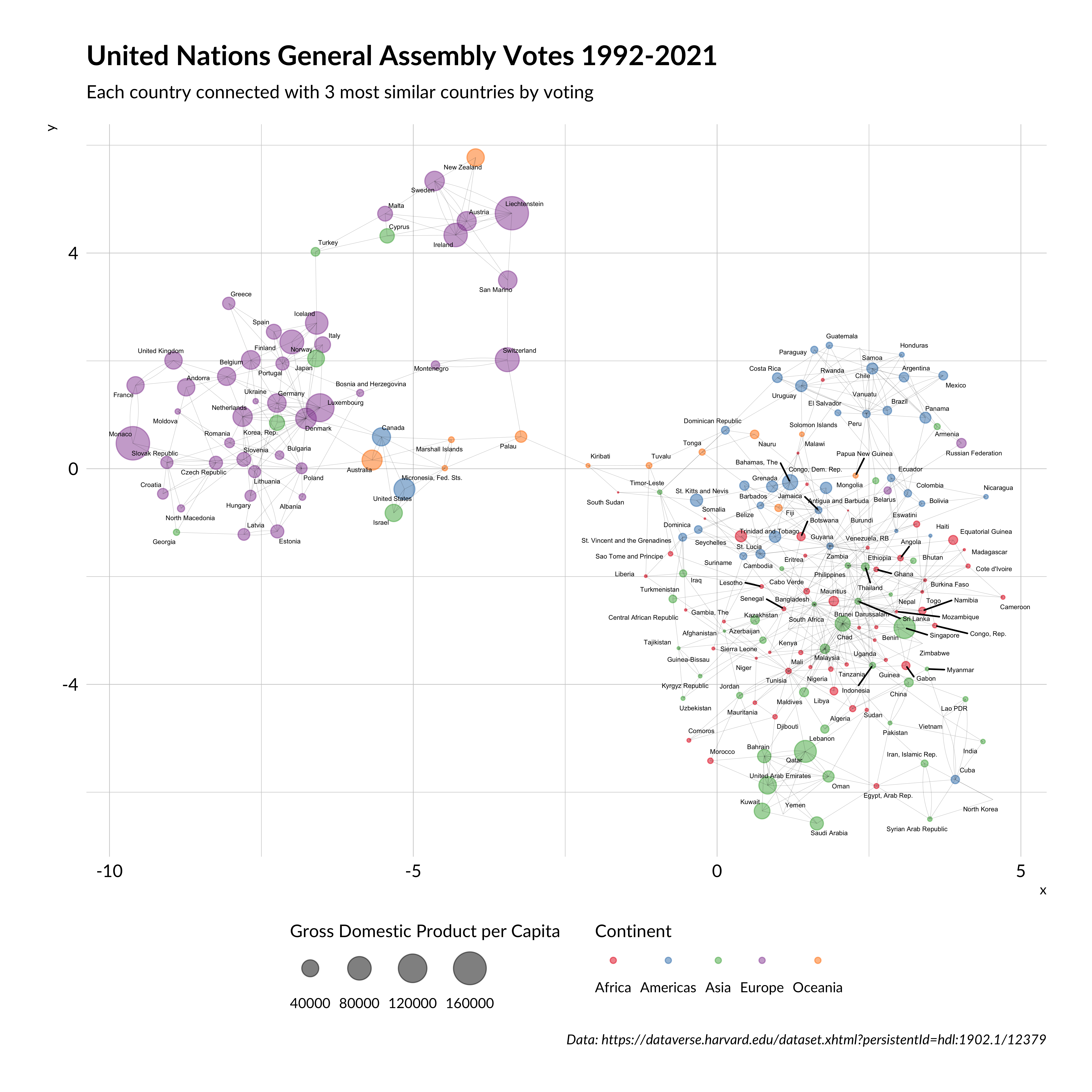
In this post, I describe approaches to show a similarity between objects using graph analysis and similarity score on the example of the United Nations General Assembly Voting in 1992-2021 years.
We love networks and graphs, but often we don’t know how to make functional graph analysis using data that we like. It’s straightforward, but we need to develop a rule to classify the relationship between each object in our dataset as “has a connection” or “has no connection”.
I show this on the example of the United Nations General Assembly Voting data.
For graph analysis and visualization, I use tidygraph and ggraph libraries. They provide flexible and tidyverse graph processing.
Also, I wanted to show gross domestic product per capita by each UN country. To do this, I found a dataset with World Bank GDP data here
Code
suppressPackageStartupMessages({require(dplyr)require(ggplot2)require(tidygraph)require(ggraph)})load("UNVotes.RData") #load data from https://dataverse.harvard.edu/dataset.xhtml?persistentId=hdl:1902.1/12379gdp <- readxl::read_excel("~/gdp.xls") %>%#gross domestic product per capita data from https://data.worldbank.org/indicator/ny.gdp.pcap.cdselect(`Country Name`, `Country Code`, `1960`:`2018`) %>% tidyr::gather("year", "gdp", -`Country Name`, -`Country Code`) %>%filter(!is.na(gdp)) %>%mutate(year =as.numeric(year)) %>%group_by(`Country Name`) %>%slice(n()) %>%mutate(Region = countrycode::countrycode(`Country Code`, origin ="iso3c", "continent") ) %>%filter(!is.na(Region))
Also, we need to do a little data cleaning. I filtered data from non-UN members in the 1992-2021 period. I recoded all votes that were not “YES” to zero for simplicity.
A similarity score means only a percentage of equal votes between each country. So score = 0 means that nations voted all-time differently. Otherwise, score = 1 means that those nations voted all-time similarly.
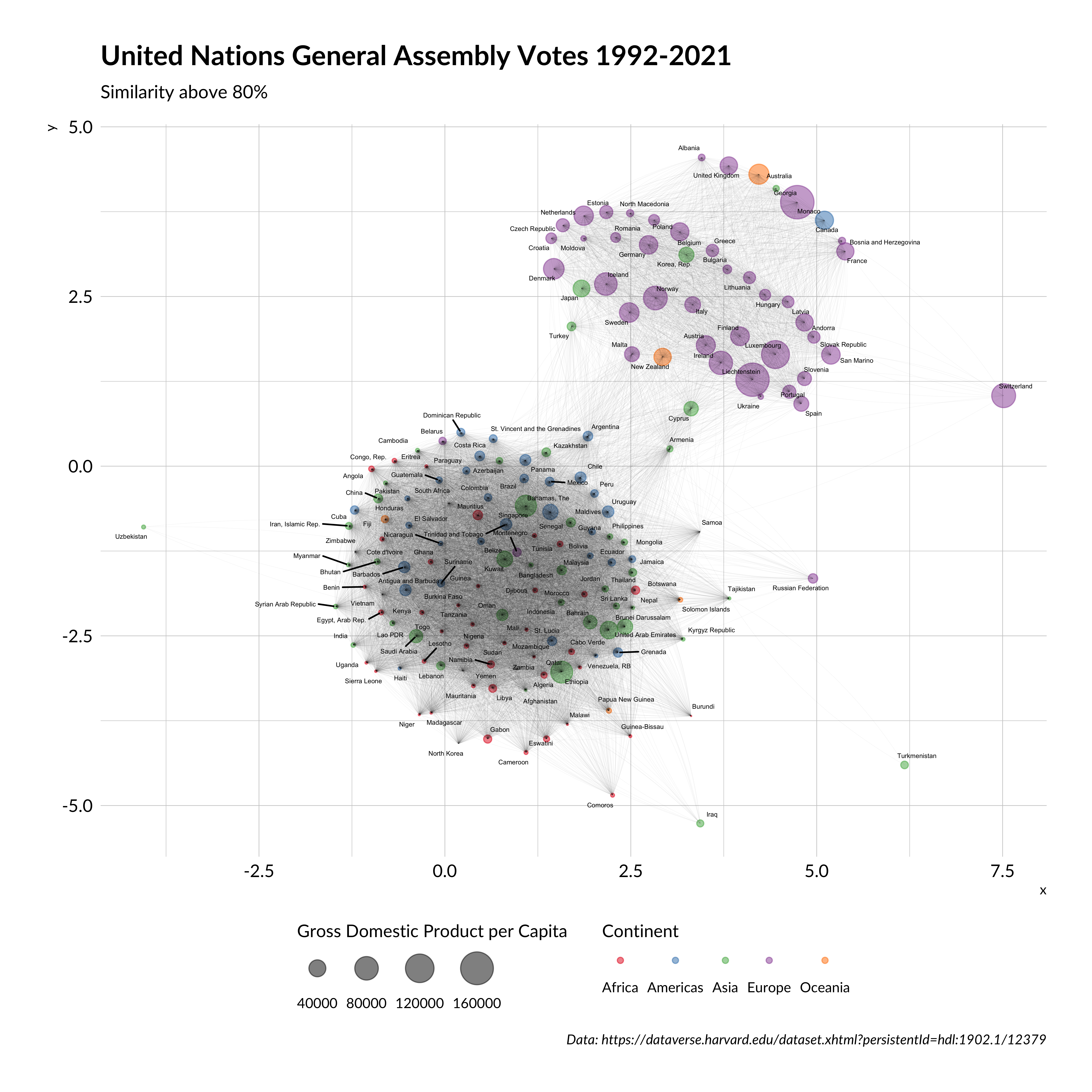
United Nations General Assembly Votes 1992-2021 (with threshold)
The result looks different, but still, there are two same clusters as in the first graph. Also, some countries are not included in this network, because they don’t have a similarity above 0.8 with any country.
Thus, both approaches are useful, but the first graph looks better and represent all countries.
---title: "United Nations General Assembly Voting graph analysis"description: | In this post, I describe approaches to show a similarity between objects using graph analysis and similarity score on the example of the United Nations General Assembly Voting in 1992-2021 years.author: - name: Roman Kyrychenko url: https://www.linkedin.com/in/kirichenko17roman/date: 2019-11-10date-modified: 05-04-2023format: html: toc: false code-tools: truetwitter: creator: "@KyrychenkoRoman"categories: - ggplot2 - ggraph - tidygraph - graph analysis - visualizationscreative_commons: CC BYimage: "United Nations General Assembly Votes 1992-2021 (with threshold).png"citation: true---```{r setup, include=FALSE}knitr::opts_chunk$set(echo = T, message = FALSE, warning = FALSE)```We love networks and graphs, but often we don't know how to make functional graph analysis using data that we like. It's straightforward, but we need to develop a rule to classify the relationship between each object in our dataset as "has a connection" or "has no connection".I show this on the example of the United Nations General Assembly Voting data.For graph analysis and visualization, I use `tidygraph` and `ggraph` libraries. They provide flexible and tidyverse graph processing.I found United Nations GA Voting data [here](https://dataverse.harvard.edu/dataset.xhtml?persistentId=hdl:1902.1/12379).Also, I wanted to show gross domestic product per capita by each UN country. To do this, I found a dataset with World Bank GDP data [here](https://data.worldbank.org/indicator/ny.gdp.pcap.cd)```{r}suppressPackageStartupMessages({require(dplyr)require(ggplot2)require(tidygraph)require(ggraph)})load("UNVotes.RData") #load data from https://dataverse.harvard.edu/dataset.xhtml?persistentId=hdl:1902.1/12379gdp <- readxl::read_excel("~/gdp.xls") %>%#gross domestic product per capita data from https://data.worldbank.org/indicator/ny.gdp.pcap.cdselect(`Country Name`, `Country Code`, `1960`:`2018`) %>% tidyr::gather("year", "gdp", -`Country Name`, -`Country Code`) %>%filter(!is.na(gdp)) %>%mutate(year =as.numeric(year)) %>%group_by(`Country Name`) %>%slice(n()) %>%mutate(Region = countrycode::countrycode(`Country Code`, origin ="iso3c", "continent") ) %>%filter(!is.na(Region))```Also, we need to do a little data cleaning. I filtered data from non-UN members in the 1992-2021 period. I recoded all votes that were not "YES" to zero for simplicity.A similarity score means only a percentage of equal votes between each country. So score = 0 means that nations voted all-time differently. Otherwise, score = 1 means that those nations voted all-time similarly.```{r}un <- completeVotes %>%ungroup() %>%select(Country, date, unres, importantvote, vote) %>%filter( vote !=9, vote !=8, date >="1992-01-01" ) %>%mutate(vote =ifelse(vote ==1, 1, 0) ) ```To find countries that vote alike, we need to find a similarity score between their voting at the General Assembly:```{r}cor_mat <- un %>%select(unres, Country, vote) %>%distinct(Country, unres, .keep_all = T) %>% widyr::pairwise_similarity(Country, unres, vote)```Now we have a challenge to define connections between countries. I offer two approaches:1. We establish a threshold above what we consider countries as friends.2. We find for each country N countries with the biggest similarity score and consider these countries as friends.Let's try the first approach:```{r}gr <- igraph::graph.data.frame( cor_mat %>%group_by(item1) %>%top_n(3, similarity) #top 3 contries)graph <-as_tbl_graph(gr) %>%left_join( gdp %>%rename(country =`Country Name`), by =c("name"="Country Code") ) %>%mutate(country =ifelse(is.na(country), countrycode::countrycode(name, origin ="iso3c", "country.name"), country) ) %>%filter(!is.na(country)) %>%mutate(Region =ifelse(is.na(Region), countrycode::countrycode(name, origin ="iso3c", "continent"), Region) ) ```Let's visualize this graph:```{r dpi=300, fig.height=10, fig.width=10, echo=TRUE, fig.cap="United Nations General Assembly Votes 1992-2021 (3 friends)"}ggraph(graph, layout = 'kk', maxiter = 10000) + geom_node_point(aes(size = gdp, color = Region), alpha = 0.5) + geom_edge_fan(alpha = 0.5, show.legend = FALSE, width = 0.05) + geom_node_text(aes(label = country), repel = T, size = 1.5, show.legend = FALSE) + scale_size(range = c(0.01, 10), name = "Gross Domestic Product per Capita", guide = guide_legend( title.position = "top", label.position = "bottom")) + scale_color_manual(values = c( "#e41a1c", "#377eb8", "#4daf4a", "#984ea3", "#ff7f00" ), name = "Continent", guide = guide_legend( title.position = "top", label.position = "bottom")) + labs( title = "United Nations General Assembly Votes 1992-2021", subtitle = "Each country connected with 3 most similar countries by voting", caption = "Data: https://dataverse.harvard.edu/dataset.xhtml?persistentId=hdl:1902.1/12379" ) + hrbrthemes::theme_ipsum(base_family = "Lato") + theme( panel.grid = element_blank(), legend.position = "bottom", axis.title = element_blank(), axis.text = element_blank() ) ```You can see that there are two clusters of nations:- European, which also contains countries founded by European migrants, as well as Japan and South Korea;- the rest of the world.Will the results we get with the second approach be different? Let's see:```{r}gr <- igraph::graph.data.frame( cor_mat %>%group_by(item1) %>%filter(similarity >0.8) #we change only this part)graph <-as_tbl_graph(gr) %>%left_join( gdp %>%rename(country =`Country Name`), by =c("name"="Country Code") ) %>%mutate(country =ifelse(is.na(country), countrycode::countrycode(name, origin ="iso3c", "country.name"), country) ) %>%filter(!is.na(country)) %>%mutate(Region =ifelse(is.na(Region), countrycode::countrycode(name, origin ="iso3c", "continent"), Region) ) ```Let's visualize this graph:```{r dpi=300, fig.height=10, fig.width=10, echo=TRUE, fig.cap="United Nations General Assembly Votes 1992-2021 (with threshold)"}p <- ggraph(graph, layout = 'kk', maxiter = 10000) + geom_node_point(aes(size = gdp, color = Region), alpha = 0.5, ) + geom_edge_fan(alpha = 0.5, show.legend = FALSE, width = 0.01) + geom_node_text(aes(label = country), repel = T, size = 1.5, show.legend = FALSE) + scale_size(range = c(0.01, 10), name = "Gross Domestic Product per Capita", guide = guide_legend( title.position = "top", label.position = "bottom")) + scale_color_manual(values = c( "#e41a1c", "#377eb8", "#4daf4a", "#984ea3", "#ff7f00" ), name = "Continent", guide = guide_legend( title.position = "top", label.position = "bottom")) + labs( title = "United Nations General Assembly Votes 1992-2021", subtitle = "Similarity above 80%", caption = "Data: https://dataverse.harvard.edu/dataset.xhtml?persistentId=hdl:1902.1/12379" ) + hrbrthemes::theme_ipsum(base_family = "Lato") + theme( panel.grid = element_blank(), legend.position = "bottom", axis.title = element_blank(), axis.text = element_blank() )p``````{r, echo=FALSE, eval=TRUE}ggsave("United Nations General Assembly Votes 1992-2021 (with threshold).png", p)```The result looks different, but still, there are two same clusters as in the first graph. Also, some countries are not included in this network, because they don't have a similarity above 0.8 with any country.Thus, both approaches are useful, but the first graph looks better and represent all countries.